A Digital Signage CMS
Skreenix is a custom SaaS-based CMS designed to help small business owners manage digital signage content with ease. Initially based on a real-world business challenge from an AV company I worked with, I used this scenario as the foundation for my UX project during RMIT’s UX/UI Design course. Following the course, I further refined the design in collaboration with the company’s back-end developer and lead AV technician. While development was later paused due to shifting business priorities, the project reflects a realistic MVP shaped by technical constraints and user needs.
The Story
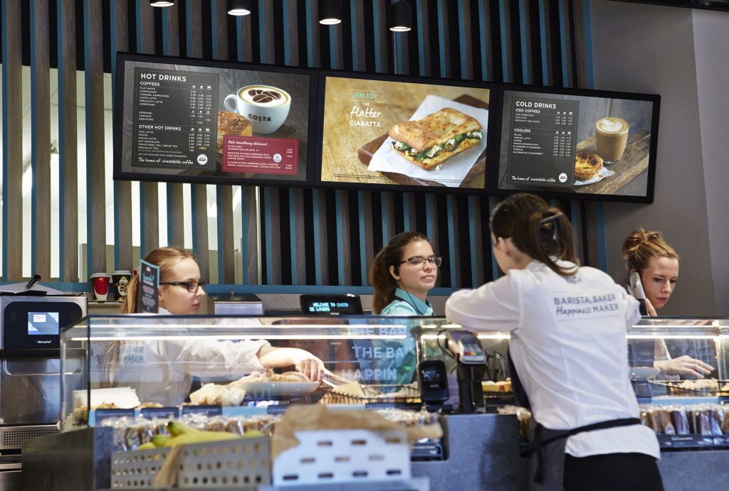
Digital signage allows businesses to display custom multimedia content on digital screens for public viewing—ranging from promotional campaigns to restaurant menus. Many of the available solutions are SaaS-based CMS platforms, enabling users to remotely log in via a browser and update content from any internet-connected device.
The AV company I worked with has extensive experience installing digital signage hardware but frequently encountered ongoing support requests due to the limitations and inconsistencies across third-party CMS tools. To address these recurring challenges, the team decided to develop its own custom web-based signage CMS called “Skreenix”. I used this real-world scenario as the foundation for my UX project, taking ownership of the research, design, and prototyping work shown below.
The Project Goal
To create a new digital signage web app called “Skreenix” that allows small business owners to update their multimedia and minimize the post-installation support.
The Plan
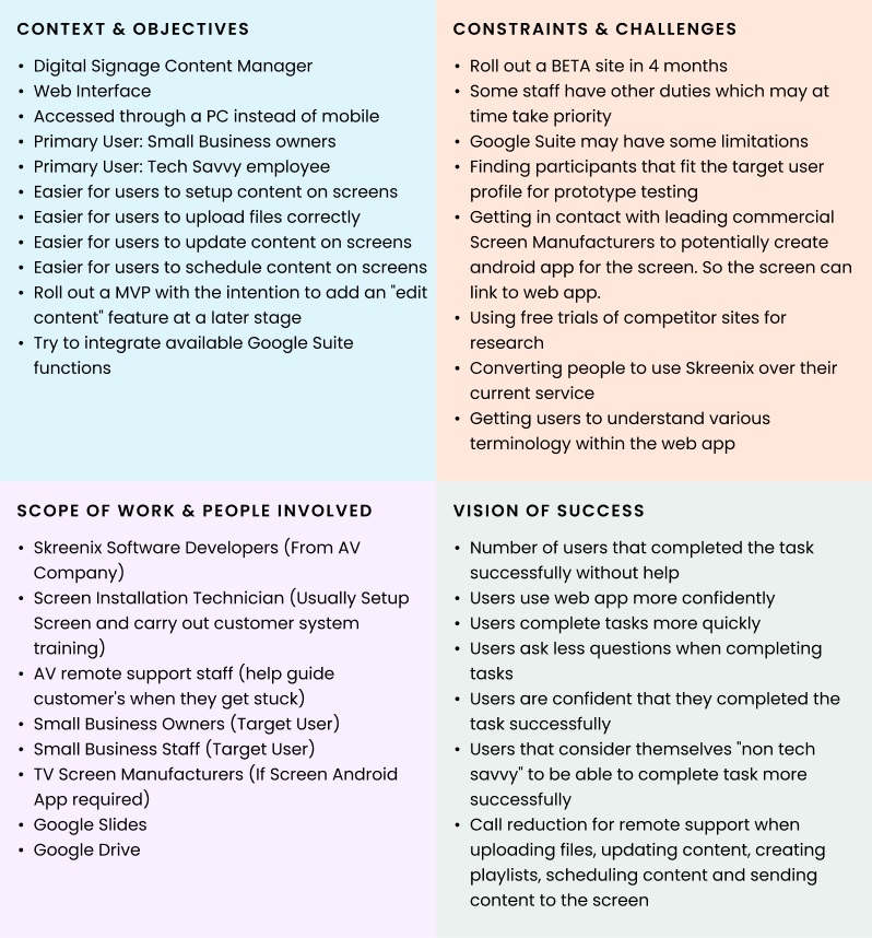
- Create a Context Clarifier
Summary of key objectives, expected challenges, project stakeholders and how success of the project can be measured - Ideation
Quick round of crazy 8’s for potential abstract ideas that could be made useful for the final solution - Detail Target Users
Analysis of target users to determine their general personality and goals.
Create a Persona - Competitor Analysis
Create a list of tasks for users to complete on 2 leading competitor sites. Observe, measure and interview the users for insights on how to create a better solution. - Redesign (Wireframing & Prototyping)
Given the insights from the user interviews, create a user flow and a working low-fidelity prototype - User Testing & Interview
Test the prototype on users and compare the results to the previous competitor site analysis. - Redesign Again
Update the prototype with any final adjustments that was deemed necessary given previous user testing. Also keep dev team in the loop to ensure designs are viable. Continue user testing & redesign while time permits or until optimal results achieved - High fidelity prototype
Create a high fidelity prototype for final testing. Once satisfactory solution achieved, hand over to dev team for implementation
Context Clarifier
Ideation
Display media onto the screen
Before delving into how to improve the process of displaying/updating media on a cloud-based service, I wanted to step back and to see if, in general, there would be a better idea on managing content on a screen
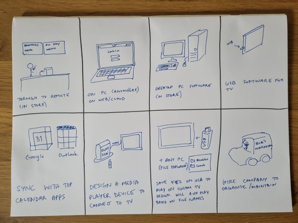
While some ideas were interesting not all were viable solutions (such as anything that would require hardware development). An interesting idea was the possibility of somehow getting it to sync with a Google or outlook calendar. As this may not be possible, it was thought that instead we could extract the functional ideas from these commonly used interfaces.
Grasping web app terminology more easily, such as playlists & schedules
As a lot of the concepts tends to be lost or forgotten to newcomers or people that would make edits infrequently, a few ideas were necessary to help users refresh their memory or more easily access this knowledge base.
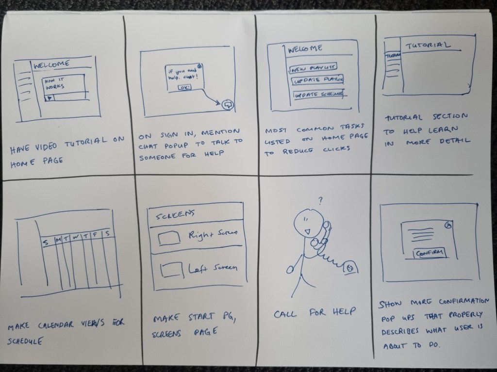
From these ideas it was decided that a combination of having a new welcome page with quick links to the most commonly actioned tasks and a tutorial video would be the most suitable solution.
Target Users
Skreenix is designed for business owners across various industries who want to showcase their products or services and attract customer attention through digital signage. While these owners may choose to adopt the system, they aren’t always the ones updating content day to day. The majority of users are expected to fall into one of the following groups:
Tech savvy small business owners or managers
These users manage or own small retail businesses and have moderate tech confidence. They’ve chosen digital signage to elevate their shop’s image and keep up with modern technology. While they may not fully understand the system yet, they believe in its potential value.
Average age: 30-50
Tech savvy colleague or employee
Often the most tech-savvy person in the business, this user has been asked to manage content updates. They’ve received a brief on what needs to be displayed, login credentials, and are expected to manage content updates.
Average age: 25 – 35
Marketing Manager or Content Specialist
Hired specifically to handle digital content, this user is familiar with digital signage platforms and marketing tools. They’re comfortable with industry terminology and can adapt quickly to new systems
Average Age: 25-55
AV Technician
Typically responsible for installing the screens on-site, AV techs assist with Skreenix setup and client training. They’re already well-versed in common digital signage systems and associated terminology.
Average Age: 20-45
Key tasks users need:
- Creating/updating playlist content
– frequent task for some users. They will either use a graphics designer to create media or create content themselves via other systems like Canva. Some Digital Signage content managers also offer an in-built editor but we found that this was less likely to be used due to it having inferior editing capabilities. - Adding/updating schedules
– could range from rare to semi frequent task depending on the user. This would be carried out by the business or a hired marketing manager. - Adding/updating screens
– rare task after initial setup. Usually carried out by an AV technician that was called to install an additional screen. - Upgrade/downgrade licenses on the go
– screens generally require a purchased license in order to operate with the web-app. These licences may have various levels which unlock advanced features such as scheduling. This is not a frequent task but it can significantly impact the user experience
While current Digital Signage content managers can carry out the main tasks listed above, the AV company observed that users often feel lost with the terminology when attempting to complete tasks by themselves.
The biggest pain point is the inability to understand the functions quickly for less frequent users of the web-app.
Persona
ERICA
“I’m a busy person so I need this to be quick and easy”

Occupation:
Café owner & Manager
Demographic:
- 32 years old
- Lives in Melbourne, VIC
- Single, no children
- Middle income earner
- New business owner
Bio:
Erica has left her corporate job to pursue a new passion project. A vegetarian café with an extensive coffee menu, mouth watering pastries, and lunch options. She is reasonably tech savvy and likes keeping things digital when possible as she likes the ease of accessing whatever she needs from her phone or laptop.
Goals:
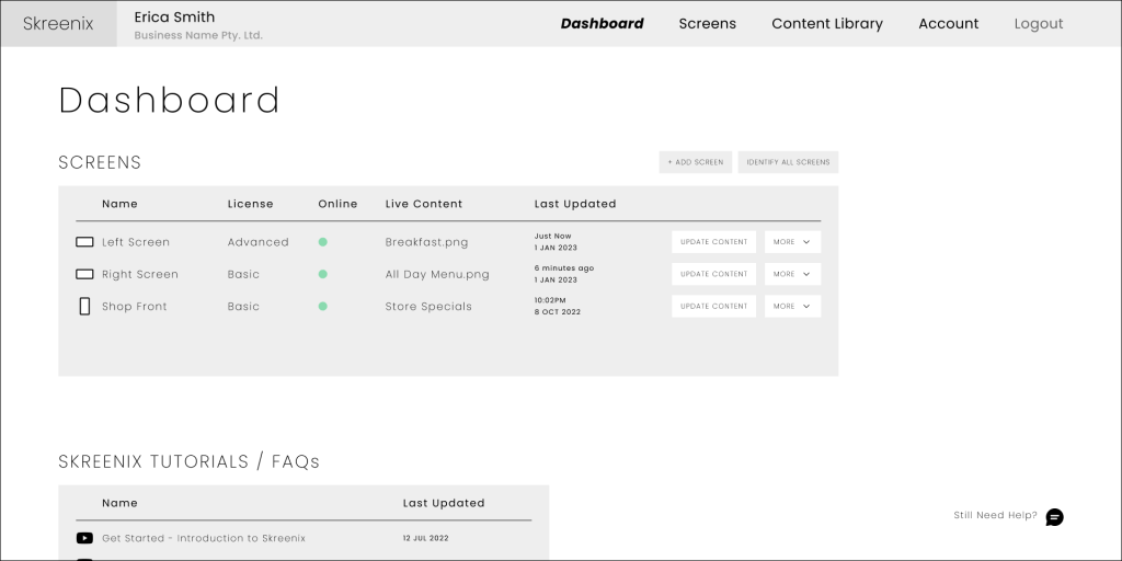
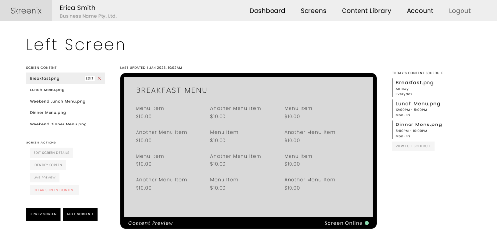
As the cafe’s opening day draws closer, everything is almost set. Erica has opted to install 2 screens near the register to display the current menu and a 3rd screen in portrait mode at the shop front. Managing everything isn’t easy and while she is confident she can handle updating the menus, she has outsourced the graphics design work to someone that can provide the sleek and modern aesthetic she’s going for.
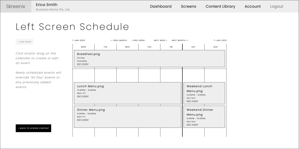
Her café will have a breakfast menu that is only available until 11AM, at which point she will switch to the lunch time menu. Pastries & drinks however, will be available all day.
Furthermore Erica wants the screen at the shop front to continuously play a video of some featured menu items in order to attract customers into the café.
Typical Services
- Update menu image files
- Upload specials video as necessary
- Create a daily schedule to switch between breakfast & lunch menu
- Add Seasonal Menus (E.g. Scheduling in a different Christmas Menu)
Pain Points:
I shouldn’t have to ask for help for something that should be easy. Especially if other websites do it better. Since I’m paying for this, I expect it to work.
- Understanding the concept of media library, a playlist, and a schedule in this context
- Where to go for updating the screen media should be obvious upon login
- Creating a schedule for a screen is really confusing
Competitor Analysis
In order to get a better understanding of the pain points and ideas on how to implement a more intuitive UI, 5 participants were selected to complete tasks using free trials from 2 leading competitors (Competitor A & Competitor B). Due to the free trial limitations, each competitor site could only be linked to one screen which was named “Test Screen”. It was set up on each competitor site the same way a typical AV Technician would set up the screen after a Digital Signage installation.
Participants were asked to come into the office with the screen ready to go and to complete the following tasks:
*Note: Participants were using an office laptop and all media files were handed to them on a USB. The tasks were first attempted on one competitor site and then the other (some looked at Competitor A first and others tried Competitor B first)
- Login to the competitor websites and explore the site for 1-2 minutes then logout
- Login and display the media file “Drinks.png” on the screen
- Update the media file to show “Pastries & Drinks.png”
- Display all media files located in the USB’s “Specials” folder as a continuous playlist on the screen
- Set up the screen to show “Breakfast.png” from 7AM – 11AM and “Lunch.png” from 11AM – 4PM
- Update the screen to show “Christmas Breakfast.png” and “Christmas Lunch.png” from December 1st to December 25th. After the 25th, revert the menu as described in task 5
Results & Clues
- All participants felt that the tasks took longer than it should
- All participants struggled with properly understanding common terminology across these sites and how they link to the physical screen (E.g. playlist, groups, schedules)
- All participants were either not confident or struggled finding out where to go to complete their first task.
- Most participants tried clicking on the screen editing section instead of the playlist editing section in order to start creating a playlist
- All participants failed to successfully complete the scheduling tasks within 5 minutes and some could not complete it at all through Competitor B.
- Most participants preferred Competitor A over Competitor B
- Participants often assumed saving a playlist or schedule was the end of the task but soon realised that it needed to be linked to the screen in order to show
- Most participants skipped the “select playlist” option since they didn’t know what it meant
- All participants did not understand the concept of a base/default playlist
- Most participants mentioned a more obvious button is needed at various stages so that it is more clear / not hidden in Competitor B website
- All participants did not try to use any in built help pages within the site
- Most participants did not notice the 24 hour time format when selecting time (chose 4am instead of pm)
- Most participants struggled with selecting a date and time
Top Insights:
- Figuring out where to go upon logging in took too long/is unclear
- The concepts of playlists, schedules, groups etc. were difficult to grasp
- There was not always clear feedback when taking an action
Redesign Recommendation
After going through the ideation process and competitor analysis, we have the following recommendations for the redesign:
- Simplify the concepts
- One screen = one schedule: Unlike competitors, schedules should always be screen-specific—not standalone or group-based.
- Remove “Base Playlist”: Uploaded content should default to an all-day repeating event. Rename this concept as “All Day Event” for clarity.
- Merge Media Library with Content: Users often mistook library uploads as live content. Consolidating into a single “Content” area avoids this confusion.
- Simplify Interaction & Flow
- Start with screen selection: After login, users should land on a dashboard listing their available screens, aligning with their mental model.
- Contextual next steps: Actions should reflect screen state (e.g. highlight “Link Screen” if not yet linked).
- Hide advanced features by default: Groups and Playlists should appear only when relevant.
- Guide users linearly through tasks: Avoid backtracking or breaking logical flow.
- Use progressive disclosure: Reveal less common features only when needed.
- Place action buttons where expected: Final actions (e.g., “Submit,” “Save”) should appear at the bottom or right side of the interface.
- Leverage Familiar UI Patterns
- Use a calendar-style interface for scheduling to tap into common user familiarity.
- Improve Visual Feedback and Usability
- Use high-contrast, conventional button styles to improve affordance.
- Provide immediate visual feedback (e.g., button state changes, confirmations, inline error messages).
- Make screen names and IDs visible to help prevent misconfiguration.
- Enhance tooltips and popups with concise, task-relevant messaging.
- Support & Onboarding
- Provide a tool to identify a screen. This is useful in case of ambiguous screen naming
- Include an FAQs and video tutorial links on the dashboard to assist new or infrequent users
- (Optional) Add a chatbot for real-time user support.
Given the above recommendations the following user flow and prototype was created.
Key User Flow Focused On:
- Login
- Select Screen
- Update schedules content
- Preview changes
- Save & push to display
This flow illustrates how a user updates media on a selected screen via the Skreenix CMS. It highlights decision points, safety checks, and backend interactions—designed collaboratively with the AV tech and backend developer to ensure technical feasibility and user clarity.
*Note: This is not an in depth prototype so various features are unavailable.
Summary
This project is a snapshot of an R&D initiative that was ultimately not pursued by the Audio-Visual company I worked for.
Following initial testing, I conducted another round that included both returning and new participants. Results showed a higher task completion rate and faster performance using the Skreenix prototype compared to competitor platforms. While some users were uncertain about where to begin tasks and none used the help features, the majority still preferred Skreenix overall.
Although the prototype could benefit from further refinements, it outperformed both competitor sites in the first round of user testing.