
UX/UI Redesign of an Online Retail Aggregator
Shop Monde aims to provide a unified interface where users can explore top online retailers in one convenient location. Given its importance to the browsing experience, the Shop Now page became a focal point in the redesign process. Each of its components was carefully examined and refined to improve usability, clarity, and overall user engagement.
Here, I’ll walk through the evolution of the color filter — explaining my thought process at each stage and the rationale behind the design decisions and changes made along the way.
Initial Design Analysis
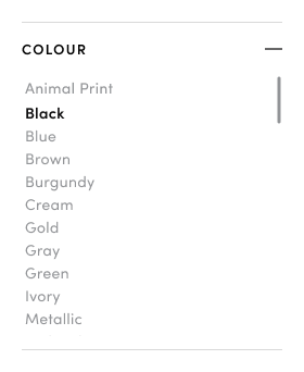
Right away, a few usability issues stand out with this color filter:
Over-reliance on text
With no visual swatches, it’s harder for users to quickly scan and choose a colour — especially when colour is such a visual decision. Furthermore while alphabetical order is generally helpful, it might actually confuse users here. Without a standardized colour system across retail platforms, users might not find what they expect. For instance, someone looking for “Champagne” may not know whether it falls under white, off-white, or something else entirely.
Tight Spacing
The limited spacing makes the filter harder to read and interact with comfortably. I expect it would increases the likelihood of mis-clicks on touch devices (such as mobile phones) where user engagement is likely high.
Unclear filter behavior
Selection feedback relies only on bold text, which may not be noticeable enough, particularly for users with low vision. It’s also unclear whether multiple selections are possible and how to deselect an option.
Lack of grouping or hierarchy
Options like “Animal Print” and “Metallic” are listed alongside basic colours which may confuse users. A review of all colour filter options and exploring more intuitive grouping/categorization would help improve clarity and usability.
Misleading “—” symbol on filter title
While not unique to the colour filter, this issue is worth highlighting. On mobile devices especially, the use of the “—” symbol would lead users to believe that the filter can be collapsed when in fact, it does nothing. This could result in confusion or frustration during navigation.
Shop Monde Users
At this stage, Shop Monde is a brand-focused retail aggregator of men’s and women’s fashion. While based in Australia, it attracts a global audience, with a significant number of users found in the US, UK and other English speaking countries.
Users vary in their familiarity with fashion and may also be influenced by what the platform highlights as trending. They value high end and premium brands and enjoy browsing products regardless of whether they are after a specific item of clothing, or just casually seeing what’s new.
Most users access the site via mobile phone, especially on popular devices like the latest iPhone, though a portion still use laptops. This makes mobile-first, touch-friendly design a key priority.
Shop Monde also aims to keep its filters aligned with evolving fashion trends, based on user interactions and on what competitors offer. For instance, colours like “Dusty Rose” or “Rose Gold” have seen renewed popularity but are still inconsistently categorized across retail sites — often grouped under a broader label like “Pink”.
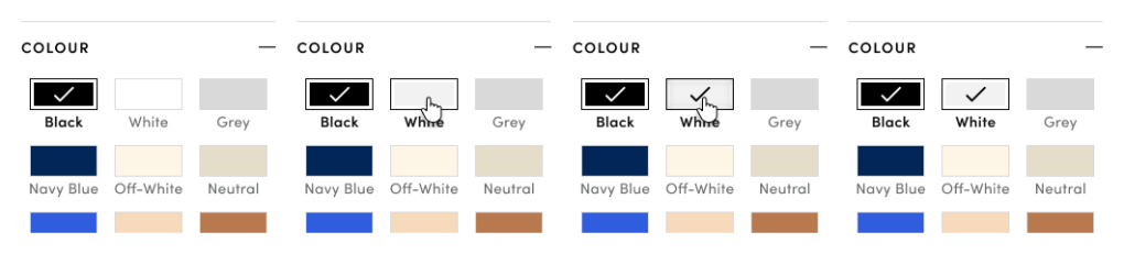
Initial Changes – Colour Filter (Version 2)
While it would have been ideal to fully explore and refine the colour filter for the most optimal solution, it was just one of many areas on the site in need of urgent redesign to reduce friction in the shopping experience.
Taken into account were changes that needed to be made throughout the site and what elements were readily available on the back-end. After discussions with the development team we found that a few minimal adjustment (e.g. checkbox size and colour styling) could be made in a timely manner and so, the following colour filter updates were handed off to the dev team:
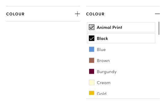
- Make filter collapsible
This would be particularly helpful on mobile devices to reduce scrolling fatigue and allow users to focus on relevant filters. - Add visual colour swatches
Improves scan-ability and speeds up recognition as processing colours is faster than through text alone - Improve spacing between options
Increased spacing will reduce mis-clicks and improve overall readability, particularly on touch screens. - Make selected item more visually distinct
A grey border and check mark was added to clearly indicate selected items, reducing ambiguity and improving usability. - Darker Text and add pattern swatch semi transparent overlay to ensure WCAG compliance
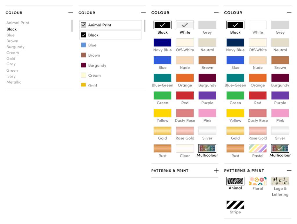
Ideal Redesign – Colour Filter (Version 3)
Following several site upgrades, including the expansion into Home & Living products, I had the opportunity to revisit key site functions. During a deeper analysis of the browsing and filtering experience on Shop Monde compared to competitor platforms, I identified further improvements for the colour filter that had previously been overlooked due to time constraints.
Drawing inspiration from other retail sites, I developed a revised set of filter options based on the most commonly used colours, expected groupings, patterns, and prints across both fashion and home categories. While this version may not be immediately viable, it represents a direction Shop Monde can move toward as product categorization and tagging improve over time.
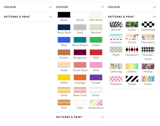
The key changes made:
- Larger Swatches were introduced to improve visibility and make selection easier at a glance
- Grid Layout replaced the vertical list, allowing more options to appear above the fold and reducing the need for excessive scrolling
- Dedicated “Pattern & Print” filter category was added to eliminate ambiguity around options like “Animal” or “Floral.”
- Colour order was reorganized into a visually intuitive rainbow-like layout, with the most popular colours placed near the top. Patterns and prints remained in alphabetical order, as popularity may vary across product categories.
- Updated base colour list was developed based on expected groupings, trending colours, and user search queries that included specific colour names.
- Swatch semi transparent overlay to darken selected colour or pattern and ensure WCAG compliance
As previously mentioned, I knew this design couldn’t be fully implemented at this stage. The purpose of this design was to collaborate with the development team to create an intermediate version that could be rolled out sooner.
Feasible Redesign – Colour Filter (Version 4)
Working with developers, I learnt more about the varying quality of product information received from partnered stores and the limitations of the auto-tagging algorithms. For example, some stores might tag a red floral dress as either “red” or “floral” but not both and many did not reference a pattern at all. As a result, implementing the full “Patterns & Prints” filter proved technically unfeasible in the short term. While AI-based filtering of product images is being explored as a long-term solution, an interim compromise was necessary to move forward.
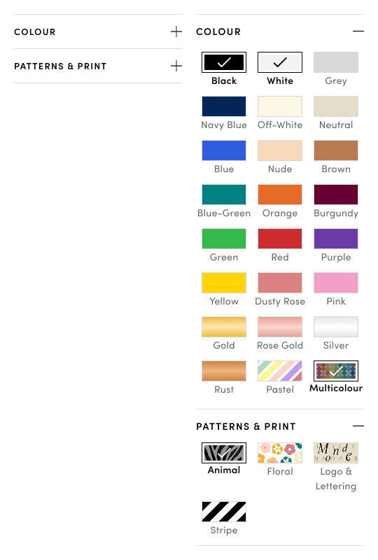
Below is a list of the final interim design changes made:
- Dedicated “Patterns & Prints” filter to highlight high-interest print types. Although most patterns proposed in version 3 weren’t consistently reflected in the store-provided product data, we were able to extract reliable tags for the most popular prints—Animal, Floral, and Stripe. Given that the Colour filter was already visually optimized for scannability, and to avoid overwhelming users with excessive scrolling, separating Patterns & Prints into its own filter ensured better usability and discoverability.
- “Logo & Lettering” inclusion. I proposed adding a “Logo & Lettering” category within the Patterns & Prints filter, despite its absence in the current product metadata. By directing our taggers to focus on high-visibility branded items, we can begin collecting user interaction data to assess its relevance. This decision was informed by qualitative insights and a noticeable shift toward brand-forward shopping behavior. When paired with the existing Brands filter (not shown here), this addition would better support users interested in exploring fashion items featuring prominent logos or typographic elements.
- Replacing “Clear” colour filter with “Pastels”. “Pastels” emerged as a popular user category and was retained within the Colour filter due to its stronger association with hue rather than pattern. It replaced the low-priority “Clear” category, which is currently grouped with “White.” This decision should be validated through future A/B testing to assess the optimal placement of “Pastels” and to determine whether “Clear” continues to be underutilized.
Summary of the colour filter evolution
While additional testing is needed for the Patterns & Prints filter, early results from the Version 4 prototype indicate improvements in both speed and accuracy of colour-based filtering. That said, I anticipate a short adjustment period for returning users familiar with the previous filter layout. With patterns and prints now placed in a separate category, some users may need time to adapt to the updated filtering structure.
Next steps include gathering more data on additional suggested patterns and conducting user testing to determine which ones should be integrated into the Patterns & Prints filter.
As Shop Monde continues to expand into new shopping categories and digital experiences, the site’s evolution remains ongoing. The Figma link below showcases my full design work, capturing ideas for how the whole platform can be enhanced depending on the direction the company chooses to take.
 Rocio Vega